

前言
标题栏是每个 App 都会有的控件,基本每个项目都会对标题栏进行封装。常见的方式是写一个标题栏的布局,用 <include/> 标签添加到每一个页面中,然后在基类里提供初始化标题栏的方法。或者是实现一个标题栏的自定义控件,使用自定义属性配置标题栏。
这两种常见的标题栏封装有个比较繁琐的地方是每次都要在布局内加标题栏控件,那么有没什么办法在不改动布局代码动态添加标题栏呢?当然有啦,ActionBar 不就是么,声明个主题都加了个标题栏。原理其实很简单,就是一波巧妙的偷天换日操作。
个人很久之前就研究过 ActionBar 源码,实现了不改动布局添加标题栏,感觉挺爽的。不过那只是简单地封装,样式也类似 ActionBar 是固定的,换个项目用可能就不合适了。当我想更进一步解耦时,发现远比想象中的难,因为样式的可能性实在太多了,还可能有些奇怪的需求。如何深度解耦个人思考了非常非常久,终于在熟悉 Kotlin 后摸索了一套比较理想的方案。
下面和大家分享一下个人深度解耦标题栏的思路和方案。
解耦思路
整理一下解耦标题栏需要实现的效果:
- 能在不改动布局代码的情况下动态添加标题栏;
- 能扩展所需的标题栏的配置参数,比如有标题跑马灯等小众需求也能支持;
- 能添加非线性的标题栏,比如可滑动隐藏的标题栏;
- 支持更新标题栏,可以不用,但不能没有;
- 解耦标题栏样式,能配置全局样式或单个页面的样式,不需要改动添加和更新标题栏的代码;
不修改布局代码添加标题栏
先来看看 ActionBar 为什么声明主题就能加标题栏的,很容易猜到是在 setContentView(id) 做了处理,那么我们看下 AppCompatActivity 的代码:
@Override
public void setContentView(@LayoutRes int layoutResID) {
    initViewTreeOwners();
    getDelegate().setContentView(layoutResID);
}
这里是用了代理模式,那么我们找到代理类 AppCompatDelegateImpl 的 setContentView(id) 函数,看下做了什么。
@Override
public void setContentView(int resId) {
    ensureSubDecor();
    ViewGroup contentParent = mSubDecor.findViewById(android.R.id.content);
    contentParent.removeAllViews();
    LayoutInflater.from(mContext).inflate(resId, contentParent);
    mAppCompatWindowCallback.getWrapped().onContentChanged();
}
可以看到传进来的布局是填充到了 mSubDecor 控件里的 id 为 android.R.id.content 的 ViewGroup 中,那么这个 mSubDecor 是怎么来的呢?第一行执行了个 ensureSubDecor() 函数,应该能找到相关线索,我们跟过去看看。
private void ensureSubDecor() {
    if (!mSubDecorInstalled) {
        mSubDecor = createSubDecor();
        // 省略部分代码
    }
}
终于找到了关键的代码,mSubDecor 是通过 createSubDecor() 函数创建的,mSubDecor 是个怎么样的控件应该能在该函数中找到答案。函数代码有点多,下面是主要的逻辑。
private ViewGroup createSubDecor() {
    TypedArray a = mContext.obtainStyledAttributes(R.styleable.AppCompatTheme);
    // ...

    // 判断是不是需要 ActionBar 的主题
    // requestWindowFeature(featureId) 函数会修改 mHasActionBar 的值
    if (a.getBoolean(R.styleable.AppCompatTheme_windowNoTitle, false)) {
        requestWindowFeature(Window.FEATURE_NO_TITLE);
    } else if (a.getBoolean(R.styleable.AppCompatTheme_windowActionBar, false)) {
        requestWindowFeature(FEATURE_SUPPORT_ACTION_BAR);
    }

    // ...

        } else if (mHasActionBar) {
            // 如果需要 ActionBar,subDecor 会填充 abc_screen_toolbar.xml 的布局
            // abc_screen_toolbar.xml 有一个 ActionBar 和 id 为 R.id.action_bar_activity_content 的容器
            subDecor = (ViewGroup) LayoutInflater.from(themedContext)
                    .inflate(R.layout.abc_screen_toolbar, null);
        }

    // ...

    final ContentFrameLayout contentView = (ContentFrameLayout) subDecor.findViewById(
            R.id.action_bar_activity_content);

    final ViewGroup windowContentView = (ViewGroup) mWindow.findViewById(android.R.id.content);
    if (windowContentView != null) {
        while (windowContentView.getChildCount() > 0) {
            final View child = windowContentView.getChildAt(0);
            windowContentView.removeViewAt(0); // 把原 android.R.id.content 容器的内容移除
            contentView.addView(child); // 添加到 R.id.action_bar_activity_content 的容器中
        }

        // 把 R.id.action_bar_activity_content 改为 android.R.id.content
        windowContentView.setId(View.NO_ID);
        contentView.setId(android.R.id.content);
    }

    // ...

    return subDecor;
}
先根据主题判断需不需要 ActionBar,如果需要 ActionBar,则 subDecor 会填充 abc_screen_toolbar.xml 布局的控件。该布局有一个 ActionBar 和一个 id 为 R.id.action_bar_activity_content 的容器,之后就是把原 android.R.id.content 容器的内容取出放到 subDecor 的容器中,用 subDecor 替代原内容。
简而言之,就是将 android.R.id.content 的内容取出来,用 R.layout.abc_screen_toolbar 布局进行装饰再放回去。用了一波偷天换日的操作给布局添加了 ActionBar。
现在一些缺省页库也基于了这个原理,因为显示缺省页通常需要给内容加个父容器,然后在父容器里切换缺省页。而通过上述方式能动态添加一个父容器,就能在不改动布局代码的情况下显示缺省页。既然添加标题栏会套一层容器,那么可以顺便支持在容器切换缺省页。
解耦标题栏样式
ActionBar 主题会用 abc_screen_toolbar.xml 布局去装饰,所以样式是固定的。我们当然不可能像这样写死一个默认的布局,应该要能根据不同项目去配置。其实可以不用写个布局,直接创建个 LinearLayout,往里面添加标题栏控件和原有的内容。
但是标题栏控件怎么得到呢,个人做过非常多的尝试,最终发现还是用适配器模式更合适。所以我们封装一个创建标题栏的适配器基类:
abstract class BaseToolbarAdapter {
  abstract fun onCreateView(inflater: LayoutInflater, parent: ViewGroup): View

  abstract fun onBindView()
}
使用适配器不仅能复用已有的标题栏布局,还能复用自定义的标题栏控件,对第三方的标题栏库进行兼容。
然后在 Application 初始化,之后添加标题栏就通过该适配器创建标题栏。
class ToolbarAdapter: BaseToolbarAapter {
  // ...
}

ToolbarManager.init(ToolbarAdapter())
这样解耦已经比 ActionBar 更灵活了,但是个人认为还不够。这只是简单地在顶部添加控件,那么更复杂的情况就不适用了,比如支持滑动隐藏的标题栏。所以写死 LinearLayout 并不好,可以进一步对装饰的控件进行解耦。
从前面 ActionBar 的相关源码可以看出装饰控件有两个关键信息,第一个是用什么进行装饰,源码里是使用 abc_screen_toolbar.xml 布局进行装饰。第二个是原本的内容添加到哪里,源码是添加到布局里的 R.id.action_bar_activity_content 容器。所以这两个不应该写死了,那么我们再封装一个装饰控件的基类进行配置。
abstract class DecorViewDelegate {
  abstract fun onCreateDecorView(context: Context, inflater: LayoutInflater): View

  abstract fun getContentParent(decorView: View): ViewGroup
}
这样就进一步地解耦,想添加一个能滑动隐藏的标题栏都没问题,只需实现布局,指明把内容添加到哪。
当然绝大多数情况还是简单地在顶部添加标题栏,我们用 LinearLayout 实现一个默认的装饰控件适配器。
class LinearDecorViewDelegate(private val views: List<View>) : DecorViewDelegate() {
  private lateinit var contentParent: FrameLayout

  override fun onCreateDecorView(context: Context, inflater: LayoutInflater) =
    LinearLayout(context).apply {
      orientation = LinearLayout.VERTICAL
      contentParent = FrameLayout(context)
      contentParent.layoutParams = FrameLayout.LayoutParams(MATCH_PARENT, MATCH_PARENT)
      views.forEach { addView(it) }
      addView(contentParent)
    }

  override fun getContentParent(decorView: View) = contentParent
}
添加标题栏
样式已经解耦了,我们可以定义一个 setToolbar() 函数给原本的布局添加标题栏。不过问题来了,参数怎么定义才合适了?
虽然通常只有标题栏、返回键、右侧按钮或文字,但是写死这么几个参数并不好,不然复杂点的情况就不适用了。比如想在图标下方加个文字,想让标题文字能滚动,还可能会有更小众的需求,把全部可能的参数都列出来很不现实。所以最好是给出常用的配置参数,并且支持让开发者根据自己的需求去增加参数。
我们先定义一个 ToolbarConfig 类来持有标题栏常见的配置参数。
class ToolbarConfig(
  var title: String? = null,
  var navBtnType: NavBtnType = NavBtnType.ICON,
  @DrawableRes var rightIcon: Int? = null,
  var rightText: String? = null,
  var onRightClickListener = View.OnClickListener? = null
)

enum class NavBtnType {
  ICON, NONE
}
封装一个 Activity.setToolbar() 扩展函数,参数是一个 ToolbarConfig 的高阶函数。
fun Activity.setToolbar(block: ToolbarConfig.() -> Unit) {
  // 根据 ActionBar 原理动态添加标题栏
}
然后就能在 Activity 用 lambda 表达式设置标题栏了。
setToolbar {
  title = "title"
  navBtnType = NavBtnType.NONE
}
目前 ToolbarConfig 的属性是写死的,如何让开发者能方便地增加属性呢?比较容易想到的是继承 ToolbarConfig 去增加属性,这要给适配器和设置标题栏的函数增加泛型,用起来麻烦了很多,个人不太推荐这么用。
经过了大量时间的思考和尝试后,终于摸索出了一个满意的封装方案,使用扩展属性 + 属性委托。首先给 ToolbarConfig 增加一个 HashMap 属性,用来保存后续增加的变量。
class ToolbarConfig(
  // ...
  val extras: HashMap<String, Any?> = HashMap(),
)
为什么要这么做呢?因为想使用 Kotlin 的扩展属性,而直接用扩展属性是不行的,由于扩展是静态的,不知道该把变量存哪。所以 ToolbarConfig 需要具备缓存任意变量的功能,这样才能扩展非静态的属性,比如:
var ToolbarConfig.isTitleRolled: boolean?
  get() = extras["isTitleRolled"] as? boolean
  set(value) {
    extras["isTitleRolled"] = value
  }
这样能增加扩展属性啦,但是代码还是有点繁琐,可以再结合属性委托来简化代码。我们封装一个委托函数,返回一个 ToolbarConfig 的属性委托类。
fun <T> toolbarExtras() = object : ReadWriteProperty<ToolbarConfig, T?> {
  @Suppress("UNCHECKED_CAST")
  override fun getValue(thisRef: ToolbarConfig, property: KProperty<*>): T? =
    thisRef.extras[property.name] as? T

  override fun setValue(thisRef: ToolbarConfig, property: KProperty<*>, value: T?) {
    thisRef.extras[property.name] = value
  }
}
通过属性委托就能进一步简化扩展属性代码了。
var ToolbarConfig.isTitleRolled: boolean? by toolbarExtras()
之后设置标题栏就能使用该扩展属性了,当然要先在标题栏的适配器里增加相应的 UI 处理。
setToolbar {
  title = "title"
  isTitleRolled = true // 扩展属性
}
更新标题栏
前面封装了一个 Activity.setToolbar() 扩展函数,但扩展是静态的,如果想再封装一个 Activity.updateToolbar() 扩展函数,是很难知道添加过怎么样的标题栏,就不知道如何去更新了。
那么用扩展实现的话,需要在设置标题栏时有个返回值去支持更新标题栏的操作,用法就改成:
private lateinit var toolbarManager: ToolbarManager

toolbarManager = setToolbar {
  title = "title"
  navBtnType = NavBtnType.NONE
}
// 更新标题栏
toolbarManager.updateToolbar {
  title = "other title"
}
能用,但是不太好用,设置个标题栏还会返回个管理类太奇怪了。虽然扩展的侵入性更低,但是这种使用方式降低了代码可读性,增加些维护成本。
个人思考了很久后还是决定再结合 Kotlin 委托进行封装,把返回值细节给隐藏了。
定义标题栏的接口和委托类。
interface IToolbar {
  fun Activity.setToolbar(block: ToolbarConfig.() -> Unit)
  fun Activity.updateToolbar(block: ToolbarConfig.() -> Unit)
}
class ToolbarDelegate : IToolbar {
  private lateinit var toolbarManager: ToolbarManager

  fun Activity.setToolbar(block: ToolbarConfig.() -> Unit) {
    toolbarManager = // 设置标题栏
  }

  fun Activity.updateToolbar(block: ToolbarConfig.() -> Unit) {
    // 更新标题栏
  }
}
修改一下基类,实现标题栏接口,并且使用 Kotlin 委托的特性把接口委托给代理对象。简单地来说就是增加 IToolbar by ToolbarDelegate() 代码。
abstract class BaseActivity : AppCompatActivity(), IToolbar by ToolbarDelegate() {
  // ...
}
之后就能愉快地设置和更新标题栏啦~
class MainActivity : BaseActivity() {

  override fun onCreate(savedInstanceState: Bundle?) {
    super.onCreate(savedInstanceState)
    // ...
    setToolbar {
      title = "title"
      navBtnType = NavBtnType.NONE
    }
  }

  private fun onEdit() {
    updateTitle { title = "Select 0" }
    // ...
  }
}
这就是整体的解耦思路了,下面会介绍具体的实现方案,有兴趣的可以结合解耦思路去阅读源码。
实现方案
个人基于以上思路封装了一个能帮助大家解耦标题栏的库—— LoadingStateView(早期叫 LoadingHelper,后来改名了)。可以深度解耦标题栏和加载中、加载失败、无数据等缺省页。
核心功能的实现类仅有 200 多行代码,最新版增加 Kotlin 委托用法后总共 500 多行代码。虽然代码量增加了一些,但是易用非常多,只需小改基类,注册默认样式,即可快速添加标题栏和缺省页。
为什么不分成标题栏库和缺省页库?不少人会有这个疑惑,这是个人深思熟虑很久才做的决定,有以下考虑:
- 支持给内容和缺省页添加头部,所以具有管理标题栏的应用场景,感觉没什么不妥。
- 大多数情况下标题栏和缺省页关联性很强,因为缺省页往往是要在标题栏下方显示,如果分成两个库就经常需要调用两个工具类,使用起来更加麻烦。
- 分成两个库可能会多一层无意义的布局嵌套。
- 即使写在一起,核心功能的实现类才 200 多行代码,还要啥自行车。由于适配器和 View 的缓存代码能复用,在解耦缺省页后,仅加多几十行代码就能把标题栏给一起解耦了,何乐而不为。
准备工作
需要修改基类,只需简单的两步就可以把本库的所有功能集成到基类。不会影响到已有的代码,只是给基类扩展了新的方法。
添加依赖:
allprojects {
    repositories {
        // ...
        maven { url 'https://www.jitpack.io' }
    }
}
dependencies {
  implementation 'com.github.DylanCaiCoding.LoadingStateView:loadingstateview-ktx:4.0.1'
}
修改基类步骤:
- 实现
LoadingState by LoadingStateDelegate(), OnReloadListener, Decorative接口,其中LoadingState接口委托给了LoadingStateDelegate代理类。 - 在 Activity 的
setContentView()方法后执行decorateContentView(this, this)。在 Fragment 的onCreateView()返回view.decorate(this, this)。
查看代码
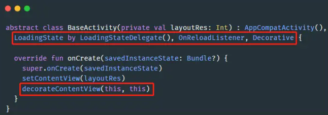
abstract class BaseActivity(private val layoutRes: Int) : AppCompatActivity(),
  LoadingState by LoadingStateDelegate(), OnReloadListener, Decorative {

  override fun onCreate(savedInstanceState: Bundle?) {
    super.onCreate(savedInstanceState)
    setContentView(layoutRes)
    decorateContentView(this, this)
  }
}
查看代码
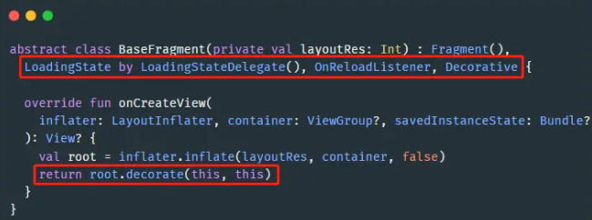
abstract class BaseFragment(private val layoutRes: Int) : Fragment(),
  LoadingState by LoadingStateDelegate(), OnReloadListener, Decorative {

  override fun onCreateView(
    inflater: LayoutInflater, container: ViewGroup?, savedInstanceState: Bundle?
  ): View? {
    val root = inflater.inflate(layoutRes, container, false)
    return root.decorate(this, this)
  }
}
这样改造基类后会得到以下的增强:
- 在不影响已有代码的情况下,增加了 LoadingState 接口提供的常用方法,该接口包含了
LoadingStateView所有功能。 - 如果担心对基类有什么影响,在页面重写
override val isDecorated = false可以把一切还原,即使调用了新增的接口方法也不会生效,请放心使用。
设置标题栏
先注册标题栏样式,之后才能调用 setToolbar(...) 方法。
创建一个类继承 BaseToolbarViewDelegate,通常项目都有各自的标题栏封装,我们能基于已有的标题栏布局或者自定义的标题栏控件实现 ToolbarViewDelegate。比如:
class ToolbarViewDelegate : BaseToolbarViewDelegate() {
  private lateinit var tvTitle: TextView
  private lateinit var ivLeft: ImageView
  private lateinit var ivRight: ImageView

  override fun onCreateToolbar(inflater: LayoutInflater, parent: ViewGroup): View {
    val view = inflater.inflate(R.layout.layout_toolbar, parent, false)
    tvTitle = view.findViewById(R.id.tv_title)
    ivLeft = view.findViewById(R.id.iv_left)
    ivRight = view.findViewById(R.id.iv_right)
    return view
  }

  override fun onBindToolbar(config: ToolbarConfig) {
    tvTitle.text = config.title

    if (config.navBtnType == NavBtnType.NONE) {
      ivLeft.visibility = View.GONE
    } else {
      ivLeft.setOnClickListener(config.onNavClickListener)
      ivLeft.visibility = View.VISIBLE
    }

    if (config.rightIcon != null) {
      ivRight.setImageResource(config.rightIcon!!)
      ivRight.setOnClickListener(config.onRightClickListener)
      ivRight.visibility = View.VISIBLE
    }
  }
}
ToolbarConfig 提供了几个常用的属性,可以根据需要选择处理,比如上述例子只实现了有无返回键和右侧按钮的逻辑。
| 属性 | 含义 |
|---|---|
| title | 标题 |
| navBtnType | 导航 (左侧) 按钮类型 |
| navIcon | 导航 (左侧) 图标 |
| navText | 导航 (左侧) 文字 |
| onNavClickListener | 导航 (左侧) 按钮点击事件 |
| rightIcon | 右侧图标 |
| rightText | 右侧文字 |
| onRightClickListener | 右侧按钮点击事件 |
onNavClickListener 默认执行 finish() 操作,可直接设置为返回键的点击事件。navBtnType 默认类型是 NavBtnType.ICON,还有 NavBtnType.NONE、NavBtnType.TEXT、NavBtnType.ICON_TEXT类型。其它的属性默认为空,为空的时候不用处理使用默认样式即可。
当然这点属性肯定不能满足所有的需求,所以本库支持给 ToolbarConfig 增加扩展属性。比如需要动态修改右侧文字颜色:
var ToolbarConfig.rightTextColor: Int? by toolbarExtras() // 增加 rightTextColor 扩展属性

class ToolbarViewDelegate : BaseToolbarViewDelegate() {
   // ...

   override fun onBindToolbar(config: ToolbarConfig) {
     // ...
     config.rightTextColor?.let { tvRight.setTextColor(it) } // 处理扩展属性
   }
}
在 Application 注册全局的标题栏 ViewDelegate。
LoadingStateView.setViewDelegatePool {
  register(ToolbarViewDelegate(), // ... )
}
之后就能在实现了基类的 Activity 或 Fragment 设置标题栏了。
setToolbar() // 默认有返回键

setToolbar("title") // 有标题和返回键

setToolbar("title", NavBtnType.NONE) // 只有标题,无返回键

setToolbar("title") {
  navIcon = R.drawable.account        // 只修改返回键图标
  navIcon { ... }                     // 只修改返回键的点击事件
  navIcon(R.drawable.message) { ... } // 修改返回键的图标和点击事件
  rightIcon(R.drawable.add) { ... }   // 添加右侧图标
  rightText("Delete") { ... }         // 添加右侧文字
  rightTextColor = Color.RED          // 新增的扩展属性,修改右侧文字颜色
}
这样就多了一种添加标题栏的方式,新写的代码可以用上述的方式添加标题栏,老的代码保留已有的 <include/> 布局或者自定义标题栏控件的用法。样式都是一样的,因为是基于已有标题栏实现的。
如果某个页面的标题栏样式变动很大,不建议写太多扩展属性来配置,这样代码阅读性也差。推荐用新布局再写一个 BaseToolbarViewDelegate 的实现类,在设置标题栏之前注册,这会覆盖掉默认的样式。比如:
registerView(SpecialToolbarViewDelegate())
setToolbar("title")
如果需要动态更新标题栏样式:
updateToolbar { title = "Loading..." }
添加多个头部
比如添加标题栏和搜索栏,搜索栏需要另写一个类继承 LoadingStateView.ViewDelegate。
setHeaders(
  ToolbarViewDelegate("Search") {
    rightIcon(R.drawable.more) { ... }
  },
  SearchViewDelegate(onSearchListener)
)
设置装饰控件
可以给内容布局再套上一层装饰,实现更复杂的样式,非简单地在顶部增加控件,比如带联动效果的标题栏、DrawerLayout、底部输入框等布局。
接下来解耦一个能滑动隐藏标题栏,先写一个 CoordinatorLayout + AppBarLayout 的标题栏布局,其中有个 FragmentLayout 是用于填充内容和显示缺省页。
<?xml version="1.0" encoding="utf-8"?>
<androidx.coordinatorlayout.widget.CoordinatorLayout xmlns:android="http://schemas.android.com/apk/res/android"
  xmlns:app="http://schemas.android.com/apk/res-auto"
  android:layout_width="match_parent"
  android:layout_height="match_parent">

  <com.google.android.material.appbar.AppBarLayout
    android:id="@+id/app_bar"
    android:layout_width="match_parent"
    android:layout_height="wrap_content"
    android:elevation="2dp">

    <androidx.appcompat.widget.Toolbar
      android:id="@+id/toolbar"
      android:layout_width="match_parent"
      android:layout_height="?attr/actionBarSize"
      app:layout_collapseMode="pin"
      app:layout_scrollFlags="scroll|enterAlways"
      app:navigationIcon="@drawable/ic_arrow_back_ios"
      android:background="@color/white"
      app:titleTextAppearance="@style/ToolbarTextAppearance" />

  </com.google.android.material.appbar.AppBarLayout>

  <FrameLayout
    android:id="@+id/content_parent"
    android:layout_width="match_parent"
    android:layout_height="match_parent"
    app:layout_behavior="@string/appbar_scrolling_view_behavior"/>

</androidx.coordinatorlayout.widget.CoordinatorLayout>
然后写一个类继承 LoadingStateView.DecorViewDelegate。
class ScrollingDecorViewDelegate(
  private val activity: Activity,
  private val title: String
) : LoadingStateView.DecorViewDelegate() {

  override fun onCreateDecorView(context: Context, inflater: LayoutInflater): View {
    val view = inflater.inflate(R.layout.layout_scrolling_toolbar, null)
    val toolbar: Toolbar = view.findViewById(R.id.toolbar)
    toolbar.title = title
    toolbar.setNavigationOnClickListener { activity.finish() }
    return view
  }

  override fun getContentParent(decorView: View): ViewGroup {
    return decorView.findViewById(R.id.content_parent)
  }
}
getContentParent(decorView) 函数是指定添加内容的容器,这里我们返回前面的 FrameLayout。
之后就可以给内容进行装饰了。
setDecorView(ScrollingDecorViewDelegate(this, "title"))
显示缺省页
顺便介绍一下缺省页功能,同样是先注册各类型缺省页的样式,之后才能调用对应的 showView() 方法。
创建类继承 LoadingStateView.ViewDelegate,构造函数传个视图类型参数,默认提供了 ViewType.LOADING、ViewType.ERROR、ViewType.EMPTY。比如:
class LoadingViewDelegate : LoadingStateView.ViewDelegate(ViewType.LOADING) {

  override fun onCreateView(inflater: LayoutInflater, parent: ViewGroup): View =
    inflater.inflate(R.layout.layout_loading, parent, false)
}
class ErrorViewDelegate : LoadingStateView.ViewDelegate(ViewType.ERROR) {

  override fun onCreateView(inflater: LayoutInflater, parent: ViewGroup): View =
    inflater.inflate(R.layout.layout_error, parent, false).apply {
      findViewById<View>(R.id.btn_reload).setOnClickListener {
        onReloadListener?.onReload()
      }
    }
}
在 Application 注册全局的 ViewDelegate。
LoadingStateView.setViewDelegatePool {
  register(LoadingViewDelegate(), ErrorViewDelegate(), EmptyViewDelegate())
}
在实现了基类的 Activity 或 Fragment 可以调用对应的 showView() 方法。
showLoadingView()  // 显示 ViewType.LOADING 类型的视图
showErrorView()    // 显示 ViewType.ERROR 类型的视图
showEmptyView()    // 显示 ViewType.EMPTY 类型的视图
showContentView()  // 显示原来的内容视图
showView(viewType) // 显示自定义类型的视图
如果需要实现点击重新加载,就在重写基类的 onReload() 方法。
如果某个页面需要显示不同的缺省页,可以在显示前调用一下 registerView(viewDelegate) 方法覆盖默认的样式。比如:
registerView(CoolLoadingViewDelegate())
showLoadingView()
如果需要动态更新某个样式,在 ViewDelegate 自行增加更新的方法,比如在 ErrorViewDelegate 增加了 updateMsg(msg) 方法修改请求失败的文字,然后就能更新了。
updateView<ErrorViewDelegate>(ViewType.ERROR) {
  updateMsg("服务器繁忙,请稍后重试")
}
结合 ViewBinding
个人还写过一个 ViewBinding 库,也能封装到基类,两者结合到一起使用才是个人理想中的用法。
添加依赖:
implementation 'com.github.DylanCaiCoding.ViewBindingKTX:viewbinding-base:2.1.0'
最新的 2.1.0 版本也增加了 Kotlin 委托用法,能更简单地把 ViewBinding 集成到基类。以下是相关的代码:
查看代码
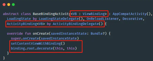
abstract class BaseBindingActivity<VB : ViewBinding> : AppCompatActivity(),
  LoadingState by LoadingStateDelegate(), OnReloadListener, Decorative,
  ActivityBinding<VB> by ActivityBindingDelegate() {

  override fun onCreate(savedInstanceState: Bundle?) {
    super.onCreate(savedInstanceState)
    setContentViewWithBinding()
    binding.root.decorate(this, this)
  }
}
查看代码
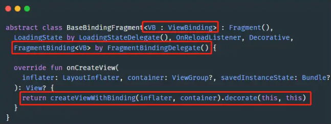
abstract class BaseBindingFragment<VB : ViewBinding> : Fragment(),
  LoadingState by LoadingStateDelegate(), OnReloadListener, Decorative,
  FragmentBinding<VB> by FragmentBindingDelegate() {

  override fun onCreateView(
    inflater: LayoutInflater, container: ViewGroup?, savedInstanceState: Bundle?
  ): View? {
    return createViewWithBinding(inflater, container).decorate(this, this)
  }
}
这样封装后不仅能在 Activity 或 Fragment 获取 binding 属性,还能很方便地指定显示缺省页的区域。
比如我们在已有的项目迭***,一些页面的布局已经写了标题栏。如果直接调用 showLoadingView() 函数,缺省页会把标题栏给覆盖了,通常要在标题栏下方显示缺省页。此时就可以重写 contentView 属性,声明在哪个控件显示缺省页,比如:
class MainActivity : BaseBindingActivity<ActivityMainBinding>() {

  override fun onCreate(savedInstanceState: Bundle?) {
    super.onCreate(savedInstanceState)
    showLoadingView()
    // ...
  }

  override val contentView get() = binding.container
}
由于要给基类增加 ViewBinding 泛型,肯定不可能直接修改基类,这会影响到已有的代码。建议继承原基类再扩展出一个支持 ViewBinding 的基类,具体如何继承修改请查看文档。
优缺点
本库唯一的缺点是不能在 xml 布局预览标题栏,因为这是动态添加的。但是解耦标题栏的收益远大于在布局上预览标题栏的收益,当各种 ViewDelegate 实现好后,可以随心所欲配置标题栏,可以直接更换一整套标题栏样式,可以动态添加支持滑动隐藏的标题栏,需求怎么变都不怕。
总结
本文讲解了 ActionBar 的实现原理,分享个人深度解耦标题栏的思路,通过适配器对样式进行解耦,结合 Kotlin 扩展和委托实现添加标题栏和更新标题栏。
然后分享了个人封装好的开源库 LoadingStateView,只需小改基类,配下项目的默认样式,即可快速添加标题栏和缺省页。我自己用得超级爽,推荐大家试用一下。如果您觉得有帮助的话,希望能点个 star 支持一下 ~ 个人会分享更多封装相关的文章和好用的开源库给大家。

 京公网安备 11010502036488号