

matplotlib 是专门为科学计算设计的优秀的图像库。
它的功能强大,能够进行以下操作:
1.高质量的2维和3维图像
2.能够生成任何常用格式的图像(jpg,png,pdf)
3.集成LaTex
4.动画 等
从一些基本的用法,我们逐渐深入matplotlib的高级应用
一·简单API
如果你使用过MatLab,那么使用matplotlib就驾轻就熟。
from pylab import *  # Depreciated
x = linspace(0, 10, 200)
y = sin(x)
plot(x, y, 'b-', linewidth=2)
show()
很简单,这段代码画出了sin函数在[0,10]间的图像:

底部的按钮中的最右侧按钮可以将图像保存为任何常用格式。
如果使用ipython notebook 画图,可以使用%matplotlib inline 将图像呈现在网页中。
注意:pylab模块集成了部分numpy和matplotlib模块的主要函数,具体而言,仅仅是从numpy中import了一些关键函数,又从matplotlib中import了一些函数,简单来说,也就两行代码。
from pylab import * 可能存在着命名冲突,要小心。
所以更加安全的代码是:
import matplotlib.pyplot as plt
import numpy as np
x = np.linspace(0, 10, 200)
y = np.sin(x)
plt.plot(x, y, 'b-', linewidth=2)
plt.show()
二·面向对象的API
上面的方法,虽然也可以使用,但是使用起来多有局限。
更高级的一种方式是:
import matplotlib.pyplot as plt  #这是画图的标准语句
import numpy as np                #当然,这是numpy的标准import语句
fig, ax = plt.subplots()           #plt.subplots()返回的是元组,fig是Figure对象实例,ax是AxesSubplot对象实例,可以说是一个框架,用来填                                   #充图像
x = np.linspace(0, 10, 200)
y = np.sin(x)
ax.plot(x, y, 'b-', linewidth=2)   #plot函数实际上是ax的方法
plt.show()
添加一些细节:legend
import matplotlib.pyplot as plt
import numpy as np
fig, ax = plt.subplots()
x = np.linspace(0, 10, 200)
y = np.sin(x)
ax.plot(x, y, 'r-', linewidth=2, label='sine function', alpha=0.6)#alpha参数可以使图像看起来更加光滑。
ax.legend()        #legend()也是ax的一种方法,用来显示标签label的内容
plt.show()

可惜的是一部分图像被legend挡住了,为了改变legend的位置,可以将ax.lengend()
替换为ax.legend(loc = 'upper center'),这样图像就更加美观了。

在plot函数中的label参数可以支持LaTeX语法
ax.plot(x, y, 'r-', linewidth=2, label=r'$y=\sin(x)$', alpha=0.6)r'$y=\sin(x)$',其中r表示这是一个raw string,在这个字符串中,'\'并不代表转义字符。

要想控制图像的y轴刻度,使用ax.set_yticks(),设定图像的标题,使用ax.set_title('a string')。
import matplotlib.pyplot as plt
import numpy as np
fig, ax = plt.subplots()
x = np.linspace(0, 10, 200)
y = np.sin(x)
ax.plot(x, y, 'r-', linewidth=2, label=r'$y=\sin(x)$', alpha=0.6)
ax.legend(loc='upper center')
ax.set_yticks([-1, 0, 1])  #y轴刻度
ax.set_title('Test plot') #标题
plt.show()

一图多线
只要曲线是使用的同一个ax,那么这些曲线都是画在同一个图像中:
import matplotlib.pyplot as plt
import numpy as np
from scipy.stats import norm
from random import uniform

fig, ax = plt.subplots() #只有一个ax实例
x = np.linspace(-4, 4, 150)
for i in range(3):
    m, s = uniform(-1, 1), uniform(1, 2)
    y = norm.pdf(x, loc=m, scale=s)
    current_label = r'$\mu = {0:.2f}$'.format(m)
    ax.plot(x, y, linewidth=2, alpha=0.6, label=current_label)
ax.legend()
plt.show()

创建多个ax对象,就有多个图像可以填充
import matplotlib.pyplot as plt
import numpy as np
from scipy.stats import norm
from random import uniform
num_rows, num_cols = 3, 2
fig, axes = plt.subplots(num_rows, num_cols, figsize=(8, 12))
for i in range(num_rows):
    for j in range(num_cols):
        m, s = uniform(-1, 1), uniform(1, 2)
        x = norm.rvs(loc=m, scale=s, size=100)
        axes[i, j].hist(x, alpha=0.6, bins=20)  #不同的axes
        t = r'$\mu = {0:.1f}, \quad \sigma = {1:.1f}$'.format(m, s)
        axes[i, j].set_title(t)
        axes[i, j].set_xticks([-4, 0, 4])
        axes[i, j].set_yticks([])
plt.show()

三维图像
import matplotlib.pyplot as plt
from mpl_toolkits.mplot3d.axes3d import Axes3D
import numpy as np
from matplotlib import cm

def f(x, y):
    return np.cos(x**2 + y**2) / (1 + x**2 + y**2)     #构建3D函数

xgrid = np.linspace(-3, 3, 50)
ygrid = xgrid
x, y = np.meshgrid(xgrid, ygrid)  #生成网格

fig = plt.figure(figsize=(8,6))
ax = fig.add_subplot(111, projection='3d')#加入图像
ax.plot_surface(x,
                y,
                f(x, y),
                rstride=2, cstride=2,
                cmap=cm.jet,
                alpha=0.7,
                linewidth=0.25)
ax.set_zlim(-0.5, 1.0) #设定Z轴范围
plt.show()

穿过原点的坐标轴
import matplotlib.pyplot as plt
import numpy as np

def subplots():
    "Custom subplots with axes throught the origin"
    fig, ax = plt.subplots()

    # Set the axes through the origin
    for spine in ['left', 'bottom']:
        ax.spines[spine].set_position('zero')
    for spine in ['right', 'top']:
        ax.spines[spine].set_color('none')

    ax.grid()
    return fig, ax


fig, ax = subplots()  # Call the local version, not plt.subplots()
x = np.linspace(-2, 10, 200)
y = np.sin(x)
ax.plot(x, y, 'r-', linewidth=2, label='sine function', alpha=0.6)
ax.legend(loc='lower right')
plt.show()

添加自定义图像
还是拿猫说事:
import numpy as np
from scipy.misc import imread, imresize
import matplotlib.pyplot as plt

img = imread('assets/cat.jpg')
img_tinted = img * [1, 0.95, 0.9] #将图像转化为数组

# Show the original image
plt.subplot(1, 2, 1)
plt.imshow(img)

# Show the tinted image
plt.subplot(1, 2, 2)

# A slight gotcha with imshow is that it might give strange results
# if presented with data that is not uint8. To work around this, we
# explicitly cast the image to uint8 before displaying it.
plt.imshow(np.uint8(img_tinted)) #为了防止产生奇怪的图像,一般先用np.unit8()对图像数组处理 2**8 = 256 所以用unit8
plt.show()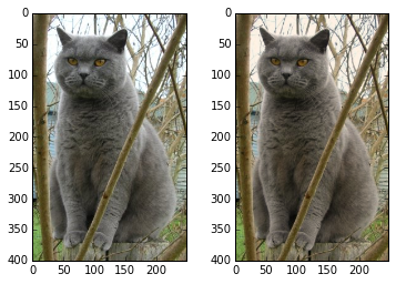

 京公网安备 11010502036488号