

由滚动条引发的一次技术性熬夜🌑

实现代码
HTML
<div class="test test-5">
      <div class="scrollbar"></div>
</div>
CSS
  .test-5::-webkit-scrollbar {
  /*滚动条整体样式*/
  width : 10px;  /*高宽分别对应横竖滚动条的尺寸*/
  height: 1px;
  }
  .test-5::-webkit-scrollbar-thumb {
  /*滚动条里面小方块*/
  border-radius   : 10px;
  background-color: skyblue;
  background-image: -webkit-linear-gradient(
      45deg,
      rgba(255, 255, 255, 0.2) 25%,
      transparent 25%,
      transparent 50%,
      rgba(255, 255, 255, 0.2) 50%,
      rgba(255, 255, 255, 0.2) 75%,
      transparent 75%,
      transparent
  );
  }
  .test-5::-webkit-scrollbar-track {
  /*滚动条里面轨道*/
  box-shadow   : inset 0 0 5px rgba(0, 0, 0, 0.2);
  background   : #ededed;
  border-radius: 10px;
  }
作者:看到请叫我不要熬夜
链接:https://www.jianshu.com/p/c2addb233acd
来源:简书
解析:
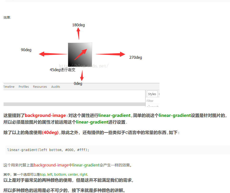
-webkit-linear-gradient线性渐变,菜鸟教程快速上手👉 https://www.runoob.com/cssref/func-linear-gradient.html
45deg,45度
rgba(255, 255, 255, 0.2) 为了添加透明度,我们使用 rgba() 函数来定义颜色结点。rgba() 函数中的最后一个参数可以是从 0 到 1 的值,它定义了颜色的透明度:0 表示完全透明,1 表示完全不透明。
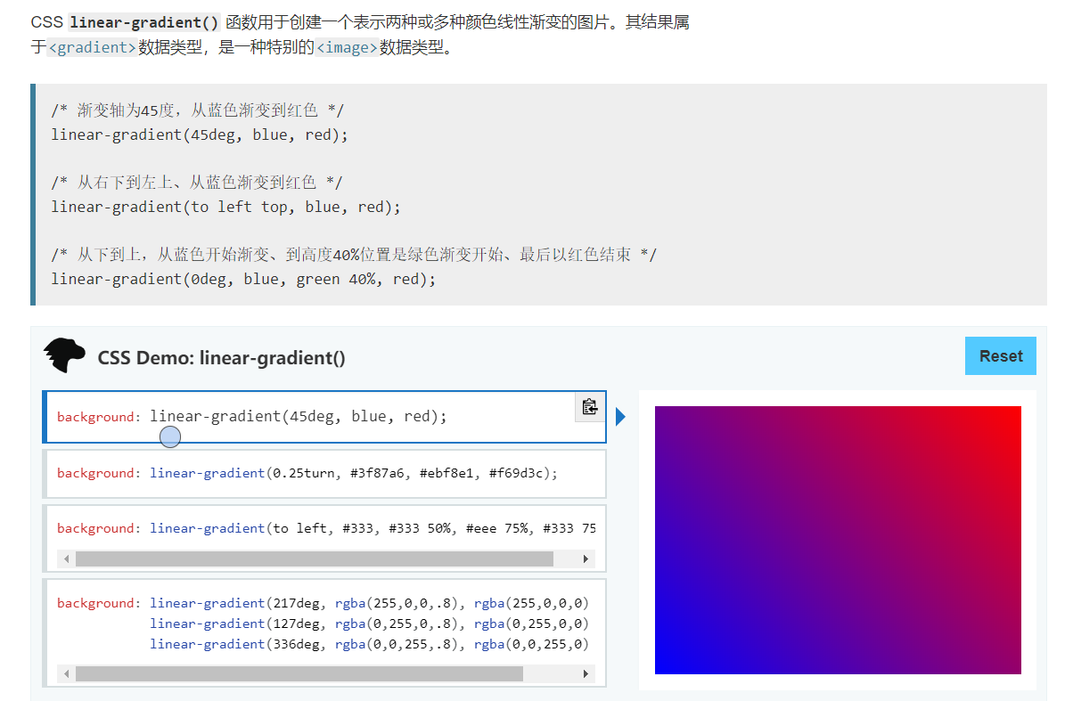
/* 渐变轴为45度,从蓝色渐变到红***r> linear-gradient(45deg, blue, red);
rgba(255, 255, 255, 0.2) 25%


出自 http://www.360doc.com/content/13/1009/11/12424571_320027721.shtml
linear-gradient 和 -webkit-linear-gradient 渐变色是反的
代码:
<style type="text/css">
.style1 { width:100px; height:100px; background:linear-gradient(to bottom, #f00, #00f); }
.style2 { width:100px; height:100px; background:-webkit-linear-gradient(bottom, #f00, #00f); }
</style>
<div class="style1"></div>
<div class="style2"></div>
实例👇
***
本文重点,其他可以不用看⚡
前面的不用看了
💥发现一篇写的超好的文章,一下子解释清楚了👇

https://blog.csdn.net/qq_18661257/article/details/50640633
 CSDN用户:77458
background-image: linear-gradient(45deg, rgba(255, 255, 255, .15) 25%, transparent 25%, transparent 50%, rgba(255, 255, 255, .15) 50%, rgba(255, 255, 255, .15) 75%, transparent 75%, transparent);
大家看着这个代码可能会有点迷糊,这是什么,写得也太长了,但是我想说的是,这个东西基本就是不均匀自主控制渐变的一个典型例子,
首先,大家要明确一个概念,就是第一个rgba(255,255,255,.15) 25%,说的是从左下角开始起到25%为rgba(255,255,255,.15),
这里默认隐藏了其实点的设定,然后transparent 25%到50%是透明的(transparent),然后就是25%到75%为rgba(255,255,255,.15)这个颜色,接着就是从75%到100%为transparent,
这里又省略了一个100%他是默认值,这代码直接使用时没有什么效果的,他必须有背景颜色做衬托。
我加了一行这个:background-color:#33CC99;呈现的效果如下:

如此便是有一个运用,那就是进程条,当我们将这个东西运用到实际的时候,会发现,这个东西形成的东西如此美观,代码如下:
<!DOCTYPE html>
<html lang="en">
<head>
	<meta charset="UTF-8">
	<title>linear-gradient</title>
	<style type="text/css">
	*{margin:0;padding:0;font-family:"微软雅黑";}/*此句为格式化页面*/
	.progress{margin:100px auto;width:80%;box-shadow:inset 0 1px 2px rgba(0,0,0,.1);border-radius:4px;
		height:20px;overflow:hidden;background-color: #f5f5f5;}
	.progress-bar{float:left;width:0;height:100%;line-height:20px;color:#fff;text-align:center;
		background-color: #5cb85c;box-shadow:inset 0 -1px 0 rgba(0,0,0,.15);}
	.progress-bar-striped{width:100px;height:100px;border:1px solid #ccc;
		background-image: linear-gradient(45deg, rgba(255, 255, 255, .15) 25%, transparent 25%, transparent 50%, rgba(255, 255, 255, .15) 50%, rgba(255, 255, 255, .15) 75%, transparent 75%, transparent);
		background-size:40px 40px;
	}
	</style>
</head>
<body>
	<div class="progress">
		<div class="progress-bar progress-bar-striped" style="width:60%">60%</div>
	</div>
</body>
</html>
效果如下:
60%是写上去的,不是智能的


 京公网安备 11010502036488号